THE CLIENT
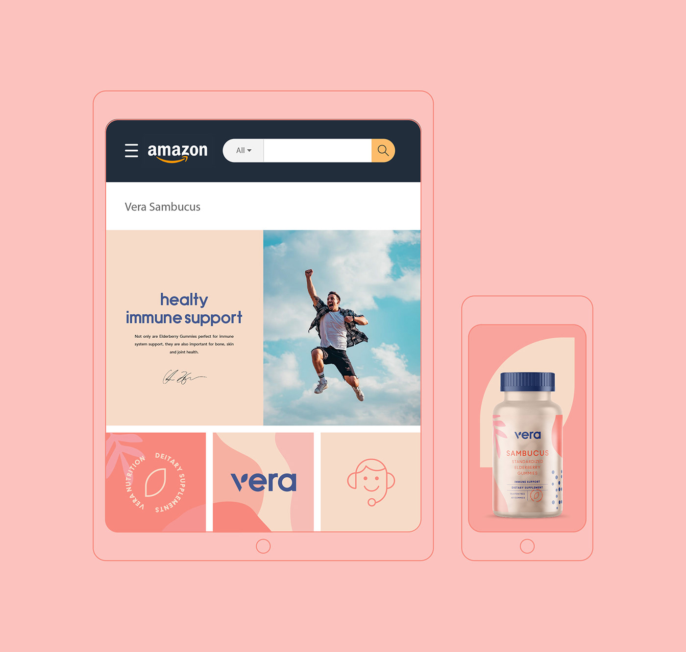
Vera Nutrition is a dietary supplement company, which helps boost the immune system, bones, skin, and joint health.
THE KEYWORDS
Earthy / Minimal / Unique / Comprehensible / Meaningful
THE SOLUTION
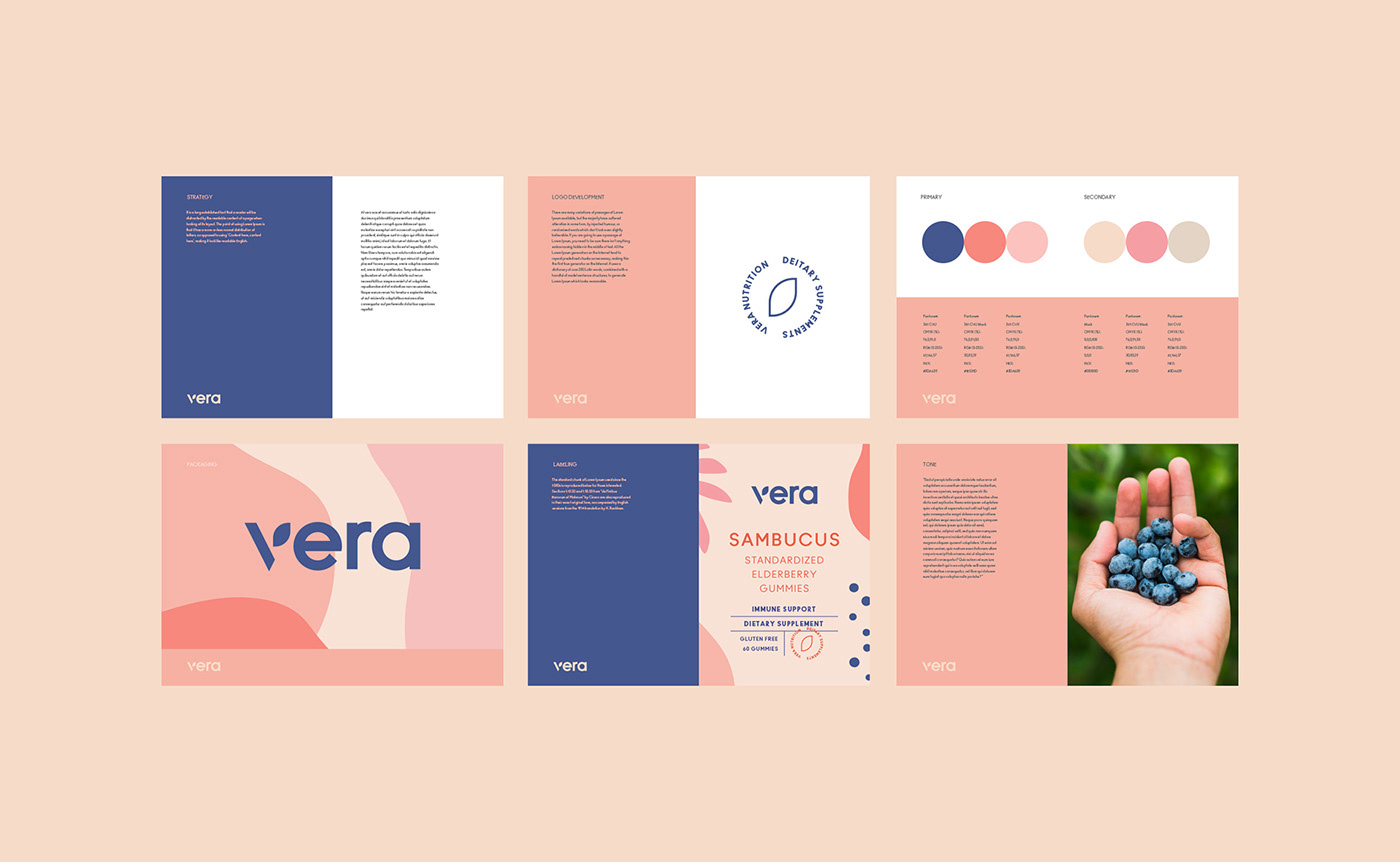
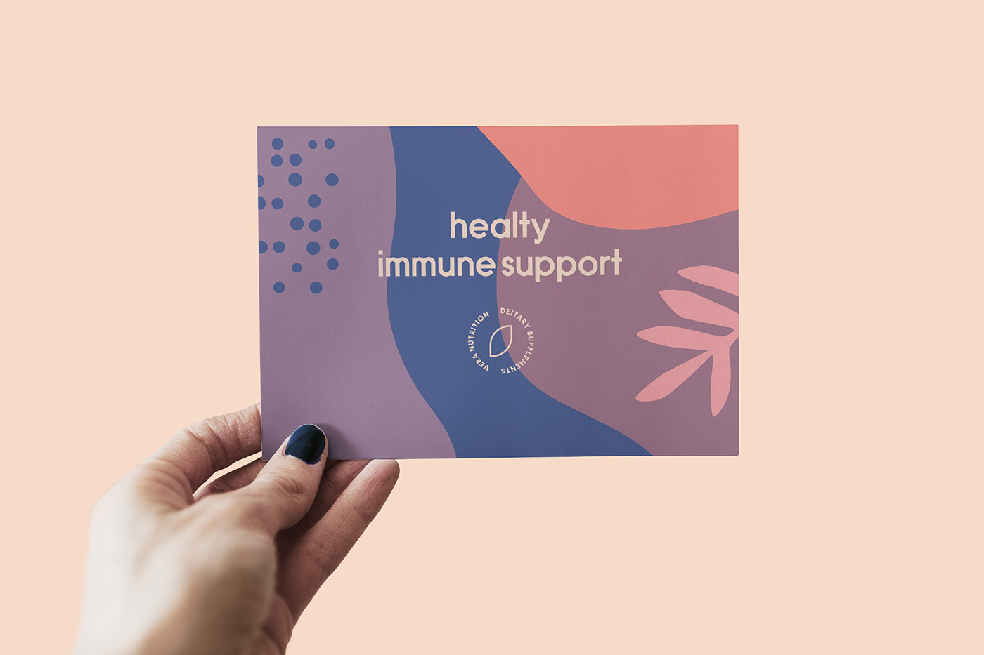
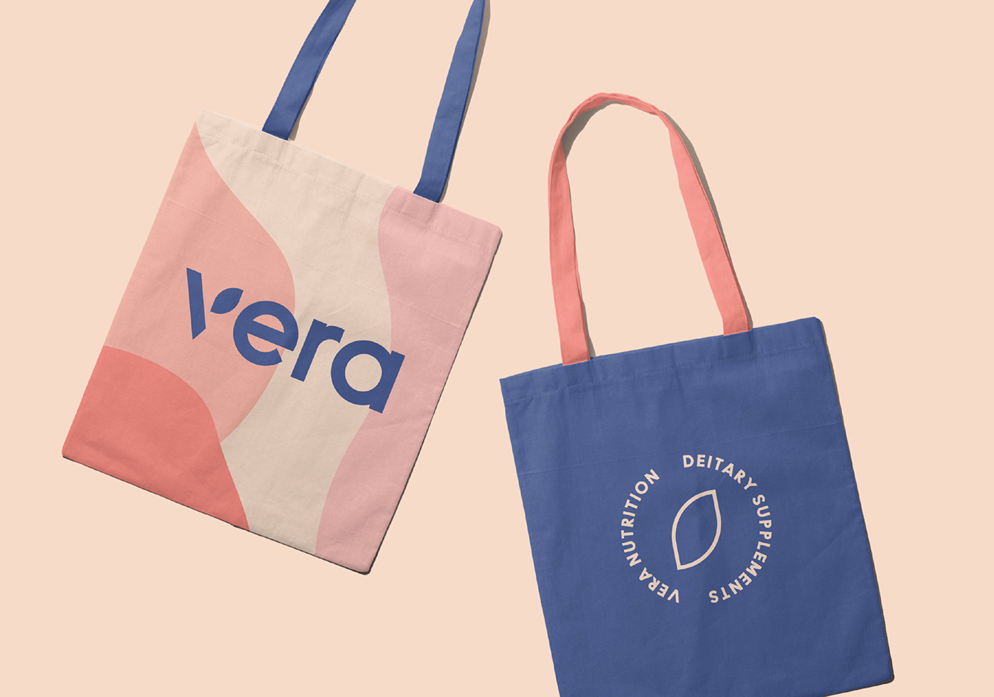
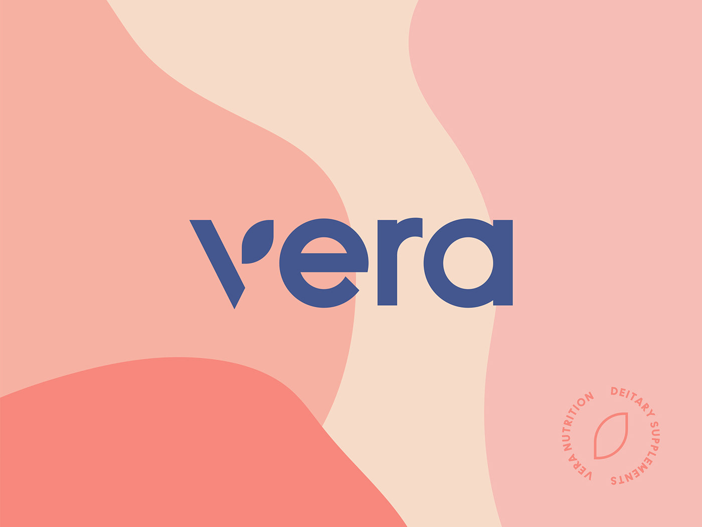
The logo was made with a minimal font for a timeless look. Due to the natural origins of the supplements, we decided to add a leaf highlight to the logo. At the same time, we created an emblem out of a leaf highlight.
For the color palette, we have selected soft and pastel shades of pink and beige, with a dark blue color as an association with the elderberry. Soft colors were picked to bring trustworthiness and positive energy to the brand and product. At the same time, dark blue has the effect of seriousness and professionalism.
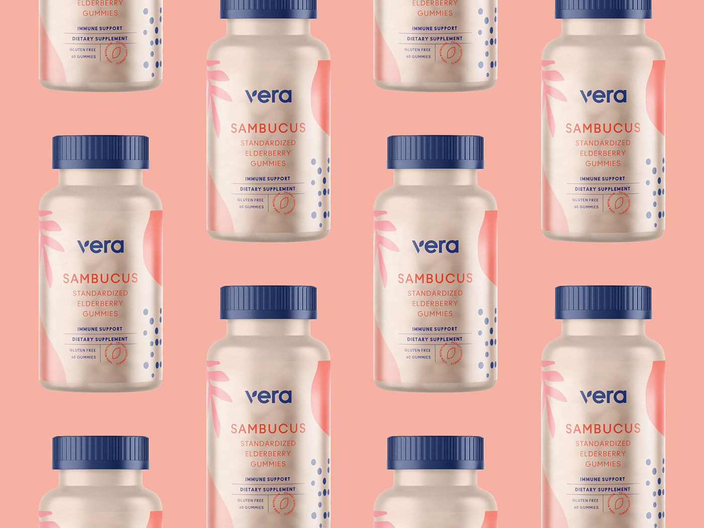
Our thoughts for the packaging included the elderberry and leaf illustrations. Our goal was also to make the packaging simple with a comprehensive layout including all the important notes and highlights.
As a result, we designed a minimal packaging with a creamy background, including ingredient illustrations and an emblem at the bottom of the label.